Picking a prom dress color sounds simple until you start seeing the same trending shades everywhere ✨ One feed says go bold, another says metallics are the move, and suddenly even a color you loved last week feels second-guessed. At MB Prom, we think the best prom color is the one that still feels like you once the flash goes off, the group photos happen, and you’re seeing the dress in real life instead of just on a screen.
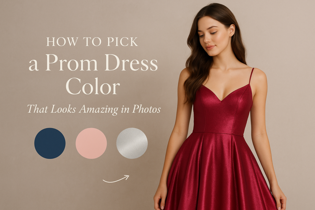
The short answer: choose a color that gives you contrast, works with your skin tone and hair, fits the overall mood you want, and still feels good in person under store lighting. For prom 2026, bold blues, pinks, reds, metallics, and softer pastel-driven shades are all having a moment, but the smartest pick is not always the loudest trend. If you want a stronger starting point, our team always recommends seeing current prom dress collections in person before locking yourself into a color idea from social media alone.
Start with how you want the dress to read, not just the color name
A lot of prom shoppers get stuck comparing color labels when what they really care about is the vibe. ???? Do you want to look polished and sleek? Soft and romantic? High-glam and dramatic? Confident and fashion-forward? The same basic color family can read completely differently depending on fabric, finish, and silhouette.
For example, a cobalt satin gown looks crisp and striking, while a powder blue tulle dress feels softer and sweeter. A red dress can feel classic, fiery, or ultra editorial depending on the cut. Metallic champagne can read elegant in one dress and much flashier in another. That is one reason trend coverage this year keeps circling back to bold color, shine, and individuality rather than one single “it” shade.
This is also where trying dresses on in person matters. Camera filters flatten differences that become obvious immediately in-store: undertones, shine level, lining, beadwork, and whether the color makes you feel bright or a little washed out. That is a big part of why shopping in person still beats guessing from screenshots, and we’ve talked before about why in-store prom shopping gives you a better read than online alone when details like fit, finish, and real color payoff matter.
A good test is to step back and ask: does this color stand out because it flatters me, or just because it is loud? If the answer is “it’s loud,” keep going. The right color should still let you be the focus.
Use photos, lighting, and your full look as the tie-breaker
The best prom color does not live on the hanger by itself. ???? It has to work with your makeup plan, your accessories, your date or friend-group photo palette, and the lighting you’ll actually be in all night. School gyms, hotel ballrooms, restaurants, and outdoor photo spots all shift color differently.
That matters more than people think. Very pale shades can look dreamy in daylight but disappear a little under dim indoor lighting if the dress does not have enough texture or contrast. Super reflective metallics can photograph beautifully, but they need the right fit and styling so the look feels elevated instead of busy. Rich jewel tones, saturated pinks, and clean reds often hold their own well in flash photography because they keep definition.
If you are torn between two shades, think beyond “which one is trending?” and ask a more useful question: which one will still make sense with everything else I’m wearing? A dress color that works with your jewelry, shoes, nails, and after-prom layers usually feels more intentional in pictures than a trend pick that fights the rest of the look.
And if your group is coordinating loosely, color matters there too. You do not need to match your date, but it helps to know whether you want contrast, complement, or a little crossover. If tux coordination is part of the plan, it helps to think about the whole photo instead of just your dress. Our prom shoppers often pair that conversation with prom tux planning so the final look feels connected without getting too matchy.
One more tip: when you try on a favorite, take photos from a few feet away, not just mirror selfies. ???? Prom photos rarely happen from arm’s length, and distance changes everything. A color that feels dramatic up close can look perfect from across the room, while a shade that seems pretty in a fitting room selfie can lose impact in full-length photos.
If you want the safest route, choose the color that gives you the clearest skin, best contrast, and easiest confidence the second you step into it. If you want the more fashion-forward route, choose the shade that still feels like you, just dialed up. Either way, the goal is not to wear the same color as everyone else or avoid trends completely. It is to find the version that looks current on the rack, strong in photos, and genuinely right for you. If you want a better sense of what MB Prom is like before you come in, you can also get a feel for us through this quick look at why so many shoppers make MB Prom a destination stop.
Ready to find your prom look?
Contact Us and let our team help you find a look that feels exciting, current, and totally you.
MB Bride & Special Occasion | MB Prom | Modern Tux
???? 123 S. Urania Ave., Greensburg, PA 15601
???? Text Us: 724-836-6626 | Call
???? mbbride.com | mbprom.com | moderntux.com